It's still a work in progress, but I was too excited to wait until everything was perfectly polished to share it with you.Thank you so much for taking the time to look through it. If you have any thoughts or suggestions, I’d be so happy to hear them in the Guestbook!
This book is best read on a desktop, in full screen.
01
About
I'm currently interning at FriendliAI on the Applied Inference Engineering team, working with AI models and inference systems and creating technical demos.
I've always been interested in AI, design, and psychology, so I enjoy turning AI capabilities into experiences people can actually use.
Ever since I was a kid, I've loved making things, from LEGO and robots to Perler beads and baking.
After watching Big Hero 6, I dreamed of becoming a biomedical engineer and building robots like Baymax that could help people heal.
After entering DGIST, I started learning Python and loved how I could try an idea and see the result right away.
I eventually graduated with a B.S. in Computer Science & Engineering.
(I also took biology and neuroscience courses for fun, especially enjoying topics around the brain and emotions.)
Early in college, I discovered Human-Computer Interaction (HCI), which brought together my interests in design, psychology, and technology.
I explored HCI through research at
DIAG
and the
Tangent Lab
and projects like
eeze: ease your life.
As someone who has always loved trying new tools (I earned a Photoshop certification at around 12), I kept trying out new AI tools, starting with ChatGPT during my sophomore year. What I love about AI is that it helps me visualize ideas that once existed only in my head, so others can see them too, discuss them with me, and help develop them further. As a Video Content Engineer Intern at Next Securities, I explored generative AI beyond LLMs through platforms like fal.ai, Higgsfield, and HeyGen. That experience made me love working with AI even more.
I love trying new things and experiencing new places. During my four years of college, I spent each summer somewhere new, with stops in Los Angeles, Vancouver, Osaka, and the Bay Area. Along the way, I met wonderful people from various backgrounds, and I can’t wait to meet more in the chapters ahead.
Hover or tap a pin to read that stop.
Outside of work, I love documenting everyday life through vlogs and blog posts, especially at cafes. (I have a 1.5M views reel hehe) I also enjoy going on picnics and being near the water, whether it's the sea or a lake. (FYI, I can't swim!)
ExtracurricularContent Creator · Created promotional content for DGIST · Best TeamInternational Student Buddy · Supported international students at DGISTDOMINO · Design club · AKGI · 2nd Prize, KOVA Capstone Design Competition Project ↗
Introduced figures to FriendliAI’s technical blogs for the first time, expanded them into animated and interactive formats, and proposed platform improvements to better showcase visual content.
Published the company’s second-most-viewed technical blog within one week, which was later featured as one of FriendliAI’s highlighted technical posts.
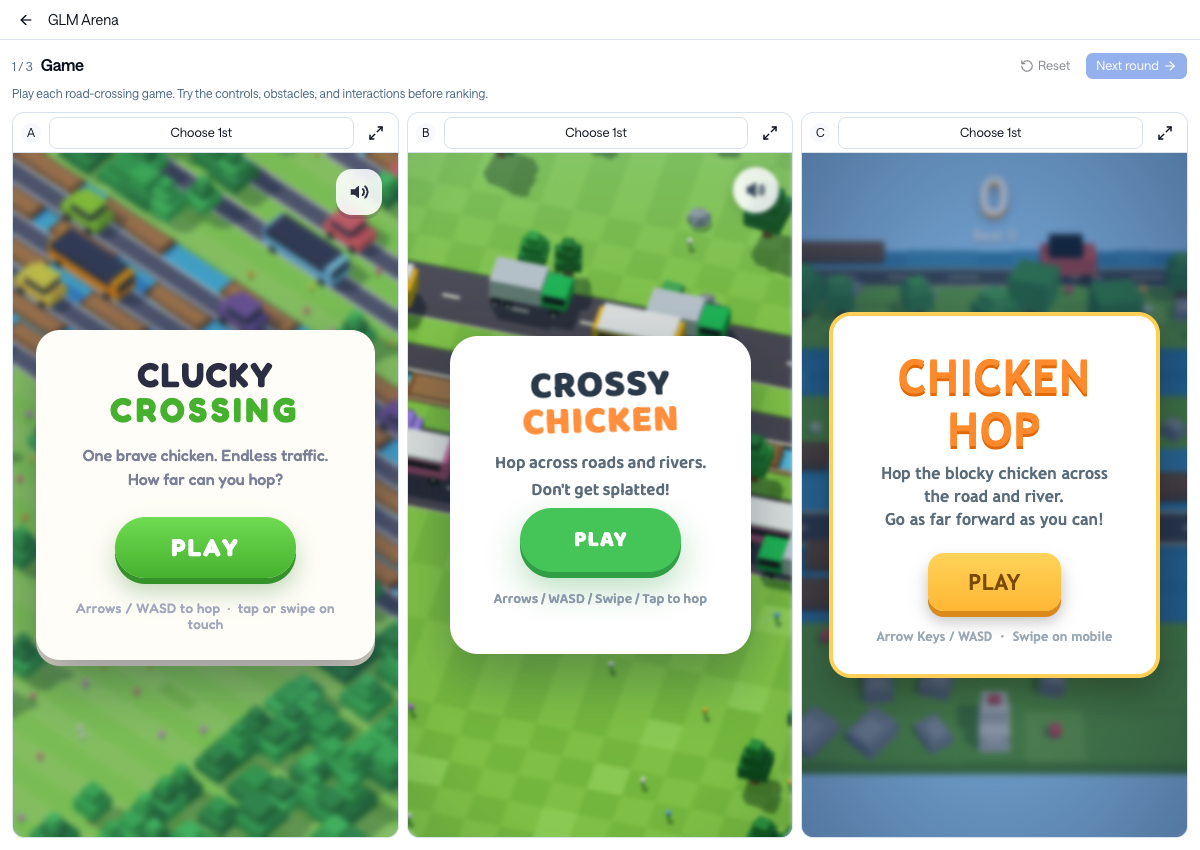
Introduced new ways to demonstrate inference performance through comparison videos and interactive games, later used at AI Engineer World’s Fair, Ai4, and company events.
Proposed improvements to Friendli Suite based on hands-on product use and customer feedback, both of which were shipped.
1. Technical Blogs
Making Technical Ideas Clearer with Figures
No figures
Static figures
Animated figures
Interactive figures
Platform improvements
My college advisor once told me that the highest level of understanding is being able to abstract and visualize an idea clearly. I liked that idea, and it has stuck with me.
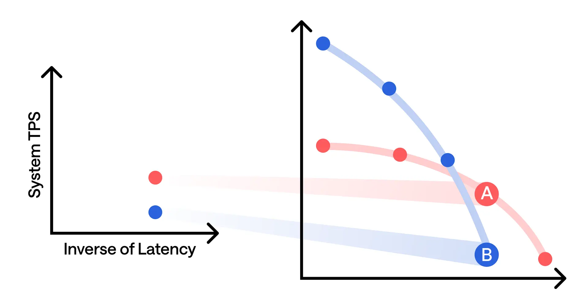
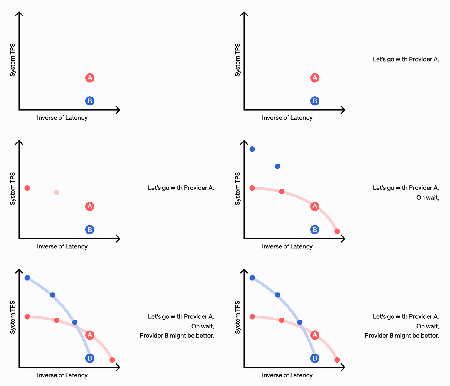
When I worked on my first technical blog at FriendliAI, I applied that thinking by introducing figures for the first time. I designed them in Figma to make concepts like the latency-throughput trade-off easier to understand at a glance.
After publishing my first article, I felt that static figures could only show part of the story I wanted to tell. I started experimenting with animation as a way to show how the data and ideas unfolded, rather than capturing everything in a single frame. I started by turning one of my existing figures into a GIF, shared it with the marketing team, and saw it later posted on FriendliAI’s LinkedIn.
For my next article, I took this further by opening with an animated figure that brought the article’s narrative together at a glance, from our evaluation approach to the models’ different behaviors.
For the next article, I wanted to go beyond showing readers the results and give them a way to explore the comparison themselves. I designed and built an interactive comparison and voting experience where readers could view outputs side by side, form their own opinions, and vote on which they preferred.
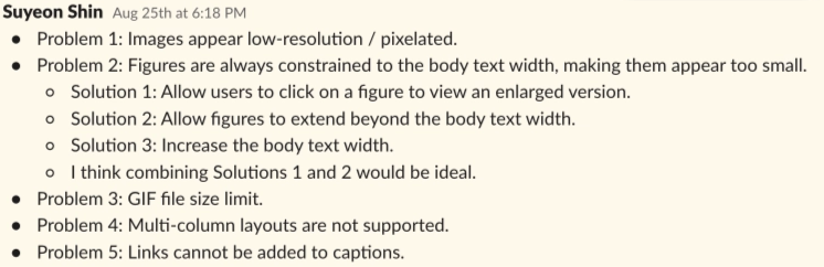
As I created more visual and interactive content, I also noticed limitations in how the blog platform presented it. I documented the issues I encountered and proposed improvements to figure resolution and sizing, GIF support, multi-column layouts, and figure captions. All of my suggestions, except for increasing the GIF size limit, were implemented, making figures and other visual content easier to view and interact with across the blog.
Blog platform feedback I shared with the team.
Behind the Blogs
Each article started with a different technical question. Beyond running experiments and analyzing results, I thought carefully about what readers needed to understand, what evidence would support the story, and how to make the findings easier to grasp. Slide the switch to any row and its story opens on the rightbelow.
I wrote this article with readers encountering Pareto fronts for the first time in mind. Since Pareto fronts are a general concept used beyond inference, I started with the broader idea and gradually narrowed it down to LLM inference, using concrete examples to explain why a single benchmark can be misleading and why the full frontier matters.
I designed three figures to follow the same progression: concept → mechanics → why it matters. Each figure builds on the previous one, from introducing the Pareto front and explaining dominated points to visually showing why a single benchmark and the full frontier can lead to different conclusions.
Writing it felt like building with LEGO. I kept arranging and rearranging ideas, examples, and visuals, questioning whether each piece logically connected to the next. It was challenging, but seeing all the pieces finally come together into one clear story is what I enjoy most about technical writing.
This was my first time leading a four-person team to develop a technical blog. I worked across the entire process, from model research and experiment design to narrative structure, writing, and figures. I planned experiments for my teammates, reviewed their results, gave feedback for the next iteration, and coordinated decisions across the team to bring everything into one coherent story.
For the open-ended evaluation, I designed a Bounce Ball game in Unity. I wanted something anyone could recognize and understand at a glance, so readers could judge the results without learning unfamiliar mechanics. Since the models differed in input modalities, I kept the game visually simple and geometric to reduce that gap and make the comparison more balanced.
I also made the games directly playable from the article. Rather than presenting model evaluation only through benchmark scores, screenshots, and analysis, I wanted readers to experience the models’ outputs themselves and make the evaluation feel more tangible.
Timing also became an important part of the project. While we were writing about GLM-5.2, GLM-5.3 was released. I proposed pivoting to 5.3 because I believed it would make the article more timely and relevant. In just three days, I led the team through rerunning the experiments, updating the analysis and figures, revising the article, and getting it published.
The article became FriendliAI’s second-most-viewed technical blog within its first week and has been featured as one of the company’s highlighted technical posts.
I started by exploring the benchmark data from different angles, comparing accuracy, cost, token usage, and agent trajectories. As I visualized the data in different ways, I noticed that both GLM-5.3 and GLM-5.3-Flash reduced cost per task, but for fundamentally different reasons. Flash benefited mainly from lower token prices, while GLM-5.3 used fewer agent turns and shorter trajectories. That distinction became the main idea of the article: the same outcome, lower cost, can come from very different model behaviors.
But benchmark data was only part of how I wanted to evaluate the models. Which model is better can depend on the workload and what a user actually values in the output. To bring that perspective into the article, I had the models build the same applications and let readers try them before revealing which model built each one. Readers could click, scroll, drag, play, and rank the outputs based on their own experience.
By combining quantitative analysis with hands-on evaluation, I wanted the comparison to capture both what the benchmark data could measure and what users could only judge by experiencing the outputs themselves.
This was a product-focused blog, so I approached it from the developer’s perspective rather than starting with FriendliLink’s features. I mapped out the user flow of trying an open-weight model with a coding agent and identified where developers would encounter friction, from configuring providers and model settings to switching models and restoring their previous setup.
I structured the article around those pain points, showing how FriendliLink simplifies each part of the workflow. I wrote with developers who had never tried an open-weight model in mind, making the problem clear enough that they could understand why FriendliLink would be useful, where it fits into their workflow, and feel confident trying it themselves.
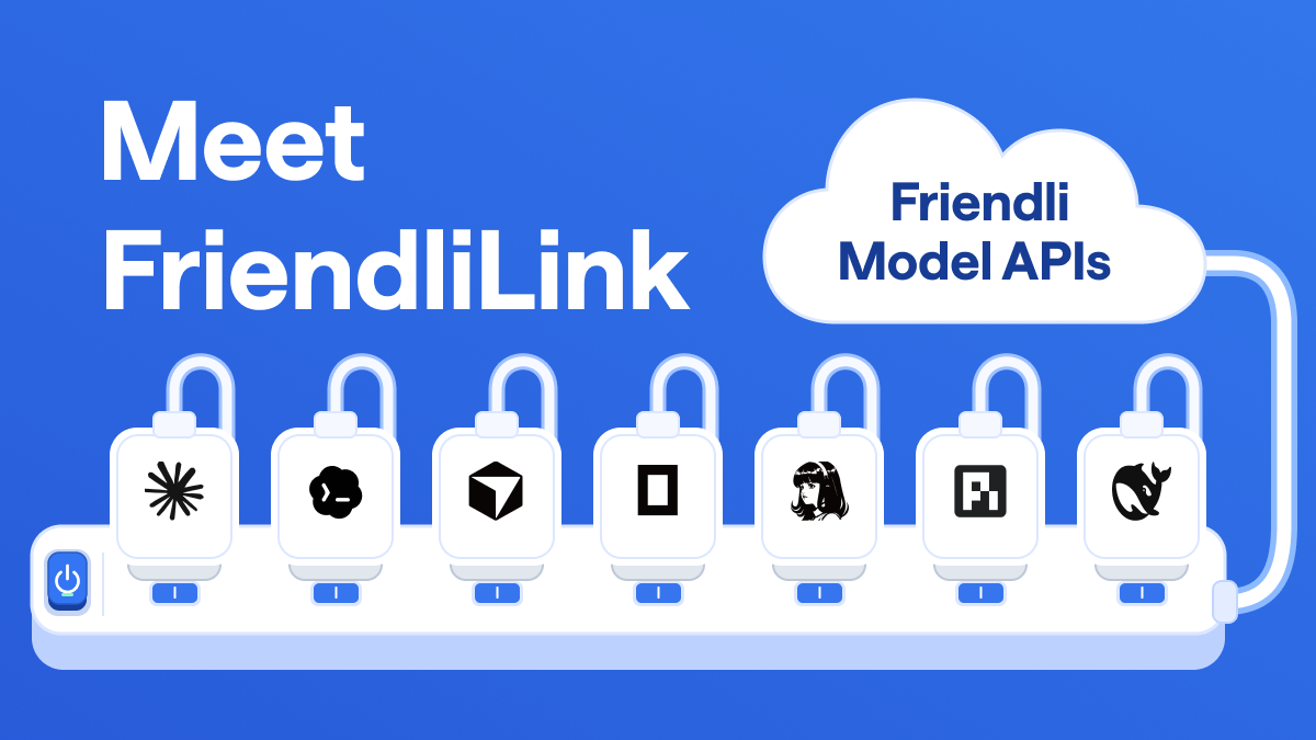
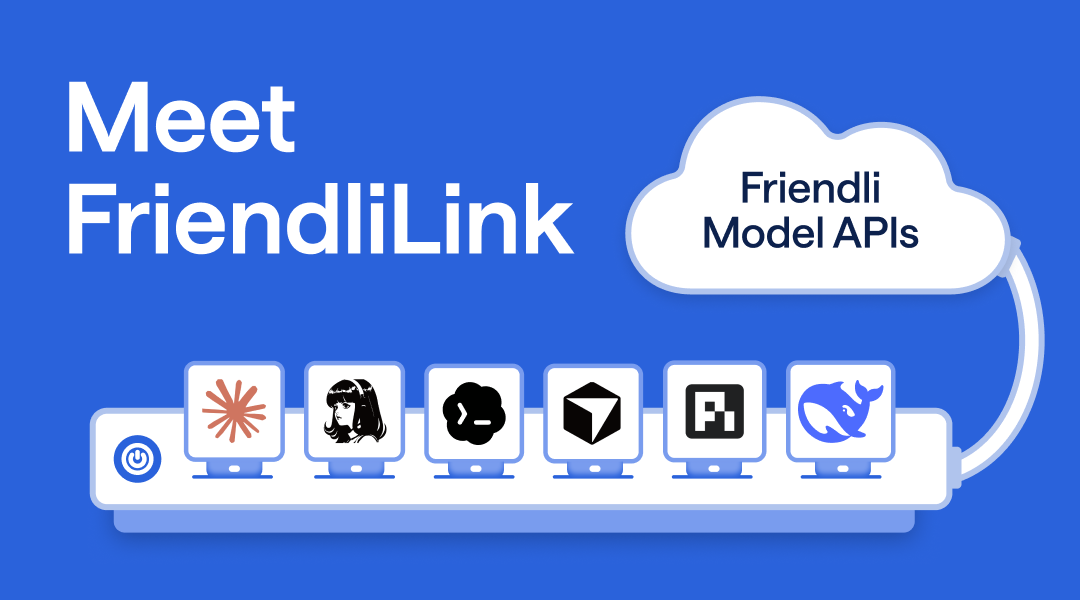
I also developed the visual concept and created the initial thumbnail mockup. FriendliLink lets you turn the connection on or off for each coding agent individually, or for all of them at once. That reminded me of a power strip, where each outlet has its own switch and a main switch turns everything on or off together. So I used a power strip as the metaphor: each coding agent plugs into its own outlet, and the power strip is connected to Friendli Model APIs, so the product’s purpose can be understood at a glance. I shared the mockup with the designer, who refined it into the final thumbnail.
My mockupFinal image, refined by the designer
2. Interactive Demos
Beyond articles, I experimented with more playful and interactive ways to communicate technical ideas. Instead of only explaining a concept, I wanted people to experience it for themselves.
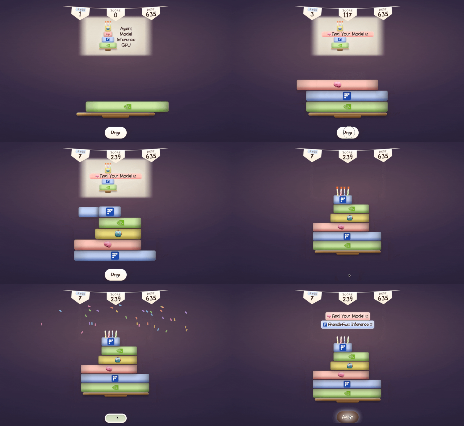
Stack Your AI Coding Cake
I designed and built this game for a demo video used in our CEO’s talk at FriendliAI’s first San Francisco office event. Since it was a special occasion, I built the experience around the company’s four-layer cake analogy for the AI coding stack and gave it a celebratory cake theme.
Rather than simply explaining GPUs, inference, models, and agents, I wanted people to discover the stack naturally through play. I also wanted the demo to be visually engaging and memorable, so I added playful details, including a microphone interaction that let players blow out the candles on the cake themselves.
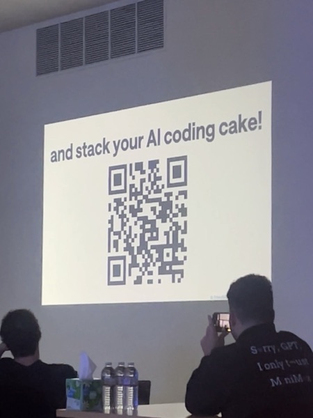
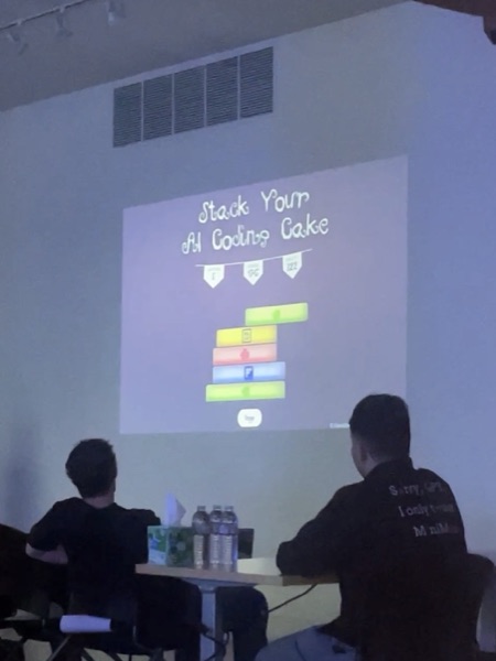
At the event, attendees could scan a QR code and play the game themselves. Seeing people pull out their phones to try something I had built was one of the most rewarding parts of the project.
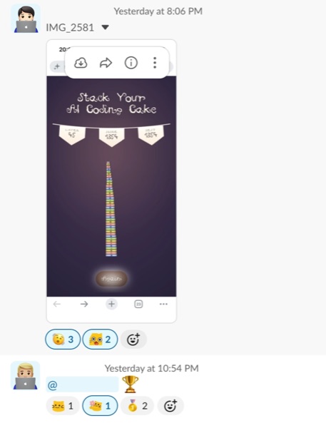
The game also took on a life of its own inside the company. People shared their scores and competed with each other in our internal channel, which was fun to see and made me appreciate how enthusiastically everyone engaged with it.
people scanning my QR!!Chief Cake Stackermy demo, on the big screen
Making Inference Speed Visible
I wanted to make FriendliAI’s inference speed immediately understandable without relying on benchmark numbers or charts. I thought the most intuitive way was to give the same prompt to coding agents running on different inference providers and show them side by side, so viewers could watch the speed difference unfold in real time.
I also wanted the output itself to be visually engaging and fun to watch. I came up with Model Crush Saga, a playful take on Candy Crush Saga that used open model logos as the game pieces. I iteratively engineered the prompt so each coding agent would attempt the same game-building task under comparable conditions.
I then turned the runs into comparison videos that made the difference in inference speed visible at a glance. The demos were later used in FriendliAI’s talks and events, including AI Engineer World’s Fair and Ai4.
I answered product and technical questions through Pylon and Intercom, helped troubleshoot issues, and organized context for escalation to the relevant teams. Working directly with customers, while also using Friendli Suite myself, helped me notice friction and turn it into concrete product feedback.
For each improvement, I tried to think from both the user experience and the engineering perspective, looking for the simplest practical change that could clearly solve the problem.
Case 1. Improving Support Discoverability
A customer booked a meeting because they couldn’t find another way to ask a product question. Looking at the support flow, I noticed that the existing support entry point was difficult to recognize.
I suggested replacing the existing icon with a familiar chat bubble, a small change that could make support easier to discover without requiring a larger redesign.
Case 2. Improving Loading Feedback
While using Friendli Suite myself, I noticed that slow page transitions could make the interface feel frozen. Without any visual feedback, I sometimes clicked multiple times because I couldn’t tell whether the page was still loading.
I suggested adding a loading indicator so users could immediately tell that their action had been registered and the page was responding.
Projects · Next Securities
Next Securities
AI Product Operations Intern → Video Content Engineer Intern · Sep 2025 – Feb 2026
Highlights
Engineered a modular video automation pipeline that enabled asset reuse, reducing production time from 2 hours to 5 minutes per video and bringing recurring generation costs to nearly $0.
Expanded the internal AI video tool from a single format to a wider range of video styles by decomposing videos into reusable visual components and developing new capabilities.
Expanded my role from data labeling into LLM evaluation, improving the video compliance system’s F1 score from 0.58 to 0.68 and designing a performance dashboard that became the team’s internal evaluation module.
Authored 39% of the team’s product backlog, identifying bugs, UX issues, and opportunities to improve content engineering and automation workflows.
Projects · Next Securities
1. Building a Better Evaluation System
I initially joined the product team to collect and label more than 700 videos for an LLM-based video compliance system. While working with the data, I became curious about the system behind it and wanted to contribute beyond labeling. Since AI products were an area I was especially interested in, I took the initiative to expand my role, analyzing the system’s errors and exploring how its performance could be measured and improved.
I introduced a confusion matrix and F1 score to evaluate the system more systematically. I logged test results in Lark Base, analyzed false positives and false negatives for each compliance rule, and used those patterns to decide which prompts needed improvement. I then iteratively revised the prompts and retested the system, improving its F1 score from 0.58 to 0.68.
Because LLM outputs could vary across repeated runs, I learned not to rely on a single result. Instead, I compared results across multiple tests and treated evaluation as an iterative process.
Confusion matrix / evaluation results
While running these evaluations, I also investigated failures in the QA workflow itself. For example, I traced failed tests to noisy and duplicated inputs exceeding the character limit, and found that videos without audio produced null STT values that blocked testing. I identified the root causes and proposed changes to make the evaluation process more reliable.
As the evaluation process became more structured, I noticed another problem: the results were still being tracked manually in spreadsheet-like tables, making it difficult to understand performance at a glance.
I designed a performance dashboard in Figma to make the evaluation results easier to track and compare, documented how the system should work, and handed the prototype off to the developers. It was later implemented as the team’s official internal QA system, replacing the manual tracking process.
Figma prototypeImplemented dashboard
2. Automating Video Production
In the second phase of my internship, I moved from the product team to the video content team, where I began working more closely at the intersection of content production and engineering.
As I worked with the existing production process, I noticed that many visual assets were being generated again for each new video. Instead of treating every video as something that had to be created from scratch, I started asking: Which parts actually need to be generated every time, and which parts can be reused?
I broke the videos down into their visual components and built a modular automation pipeline around reusable assets. Rather than repeatedly generating the same types of backgrounds and visual elements, the pipeline could generate them once, store them, and reuse them across future videos.
This reduced production time from 2 hours to 5 minutes per video and brought recurring background-generation costs from about $5 to nearly $0. While creating the initial asset library still required a one-time generation cost, repeated production no longer required generating the same assets again.
3. Expanding What AI Video Could Create
After automating the production workflow, I started looking at another limitation: the internal tool could only produce a narrow range of video styles, mainly following the same Korean board-style format.
Instead of treating each video as a single asset, I began breaking it down into smaller visual components, such as backgrounds, text, images, charts, and motion. By understanding how these pieces worked together and recombining them in different ways, I expanded the tool from a single format into a wider range of video styles and use cases.
Existing formatDifferent video styles I developed
One capability I explored further was financial chart generation. Existing AI video tools could create chart-like visuals, but they struggled when the output needed to follow precise requirements, such as a specific company or timeframe.
To test a more reliable approach, I built a Python prototype that generated stock charts from natural-language requests. The system interpreted the requested company and timeframe, retrieved the corresponding stock data, and generated a customizable chart that could be used directly as a video asset.
For example, a request like “Create a 5-year stock chart for NVIDIA” could produce a chart with the correct timeframe, company-specific styling, and a transparent background for use in video production.
NVIDIA 5-year chartAmazon 10-day chart
Projects · eeze
eeze: ease your life
Personal Project · Dec 2025 – present
Highlights
Designed and built the physical stress ball and LLM-powered mobile experience end to end, embedding a pressure sensor and microcontroller inside the ball and connecting it to the app through Bluetooth Low Energy.
Released eeze on the App Store and iterated based on user feedback, including adding immersive soundscapes in response to requests for non-visual immersion.
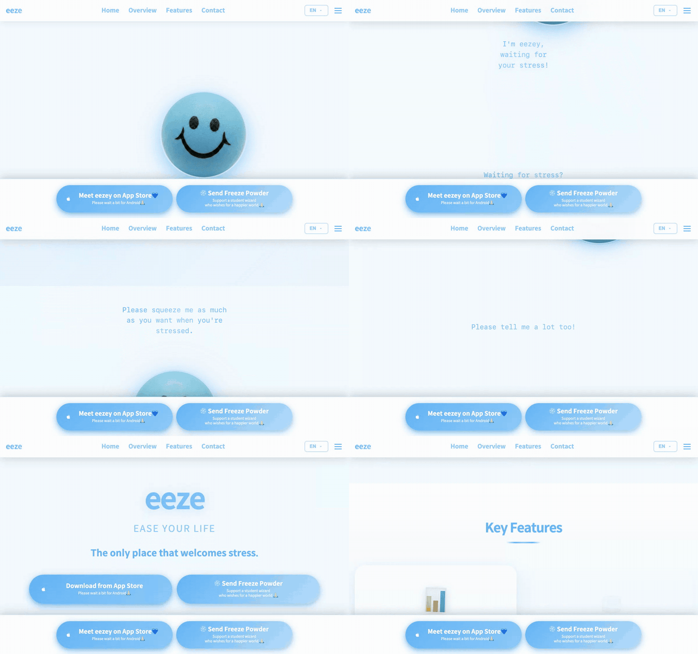
Designed and built eeze’s landing page ↗ as a visual story, introducing the character and the idea behind the project before presenting the product itself.
Independently developed eeze into an HCI research project, taking it through CHI 2026 and later revising and resubmitting the work to UIST 2026.
I’ve always liked talking through my worries and hearing other people’s perspectives. But over time, I became more conscious of sharing negative feelings with others and started keeping more of them to myself.
During those moments, I found myself talking to AI instead. Having somewhere I could express what I was feeling without worrying about burdening someone made it easier to open up. That experience became the starting point for eeze.
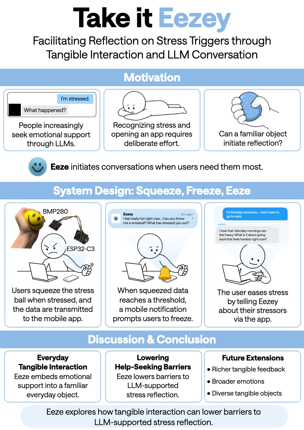
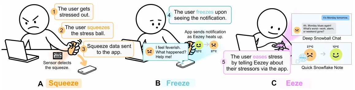
I wanted to create an experience where stress itself felt welcome. Instead of asking users to immediately explain how they feel, I started with something simpler and more instinctive: squeezing a stress ball. From there, users can express what triggered the stress, keep a record of it, or continue into a conversation with eezey.
Squeeze → Freeze → Eeze: from a squeeze to a moment of reflection
2. How I Built It
I wanted the squeeze to be more than an interaction on a screen, so I built a physical stress ball that could communicate with the app in real time.
I cut open a soft sponge stress ball and embedded a BMP280 pressure sensor and ESP32-C3 microcontroller inside it. The ESP32-C3 sends grip-pressure data to the app through Bluetooth Low Energy (BLE), allowing eezey’s heat level to respond to the user’s squeeze in real time.
While integrating the hardware, dependency conflicts in React Native blocked me from testing the BLE connection. Rather than letting that stop the hardware development, I built a separate Swift testing environment to verify real-time sensor streaming and BLE connectivity independently.
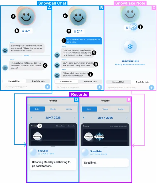
On the app side, I connected Snowball Chat to the Gemini API so users could talk through what triggered their stress with eezey, turning a squeeze into a guided moment of reflection.
I also designed an on-screen squeeze interaction with touch and haptic feedback, so users could experience the core interaction even without the physical prototype.
Snowball Chat, Snowflake Note, and Records in the eeze app
3. How I Learned from Users
I didn’t want to wait until every part of eeze was finished before putting it in front of people. I released an early version on the App Store and gathered feedback through a survey linked inside the app and conversations on Threads to understand what the experience was still missing.
One piece of feedback that stood out was the desire for a way to feel immersed without relying only on the screen. Based on that feedback, I added immersive soundscapes, giving users another way to pause and engage with the experience through sound.
As I shared eeze with more people, I also thought carefully about how I wanted to communicate the project itself. Storytelling is an important part of how I design, so I designed and built eeze’s landing page as a visual story rather than simply listing its features.
I introduced eezey and the idea behind the project first, then gradually led visitors into the product and its interactions so they could understand why eeze exists before what it does.
4. How I Turned It into HCI Research
Before eeze, I had spent over a year in a research lab, contributing to experiments, interaction design, and figures, but I had never experienced the full writing and publication process myself. I wanted to take an idea through that entire process, from research and writing to submission.
I independently developed eeze into a CHI 2026 poster submission, titled Take it Eezey: Facilitating Reflection on Stress Triggers through Tangible Interaction and LLM Conversation. Since it was my first time navigating the publication process, I reached out to Minsun Kim, who had experience publishing at CHI, for guidance. Her feedback helped me refine how I framed and communicated the work.
I later revisited the project independently for UIST 2026, simplifying both the app and the research before resubmitting it. This process taught me to identify what matters most, remove unnecessary complexity, and communicate an idea more clearly.
That mindset later carried into my technical writing at FriendliAI, where I think carefully about how experiments, figures, and writing come together to tell one clear story.
Poster · submitted to UIST 2026 · Take it Eezey ·
Projects · MRfidget
MRfidget
Research Intern · Jul 2024 – Aug 2024
Digital fidgeting in mixed reality · Apple Vision Pro
HCI Research · Gesture Recognition · Prototyping Simon Fraser University · Tangent Lab · Team of 5
Highlights
Designed and implemented gesture-recognition prototypes for Apple Vision Pro, translating fidgeting behaviors such as squeezing, snapping, and pen clicking into measurable relationships between hand joints.
Developed and tested the gestures directly on Apple Vision Pro, iteratively adjusting detection thresholds and adding real-time visual feedback to debug recognition behavior.
Created shared Notion documentation for a remote, international team, organizing gesture definitions, code, implementation ideas, and on-device test recordings so teammates could easily understand and build on the prototypes.
I participated in HCI research exploring fidgeting in mixed reality. My role was to investigate how everyday fidgeting behaviors could be translated into gestures that Apple Vision Pro could recognize.
The biggest challenge was turning fidgeting, an intuitive human behavior, into measurable conditions in code. Starting from the open-source Vision-Pro-Head-Hand-Tracking-Demo ↗, I defined each gesture through relationships between tracked hand joints and implemented the recognition logic in Swift.
Gesture
How I translated it
Implementation
Squeezing
Wrist and middle fingertip move closer together.
closeTo("rightWrist", "rightMiddleTip")
Snapping
Thumb and middle fingertip touch.
touching("rightThumbTip", "rightMiddleTip")
Pen clicking
Thumb and index fingertip move within a specified distance.
These rules were intentionally simple prototypes for translating observed movements into testable joint conditions. For example, the snapping prototype detects fingertip contact rather than the entire snapping motion.
Projects · MRfidget
Testing on Apple Vision Pro
Because Apple Vision Pro had just been released, development resources and references were limited. I also had no prior SwiftUI experience, so I developed the prototypes through repeated cycles of implementation and on-device testing.
Finding the right threshold
One challenge was determining how close two joints needed to be before the system should recognize a gesture.
For squeezing, I tested different distance thresholds, including 0.05 and 0.2, and found 0.1 to be the most stable value through repeated on-device testing. For pen clicking, I used a threshold of 0.05.
Rather than choosing these values only from the code, I adjusted them by repeatedly performing the gestures and observing how the system responded on Apple Vision Pro.
Making recognition visible
To make the recognition behavior easier to debug, I added real-time visual feedback to the tracked hand joints.
The markers turned red when a gesture condition was met and cyan when it was not, allowing me to immediately see when the system recognized a movement and adjust the detection logic accordingly.
Squeezing & snapping · On-device test recording Tracked joints turn red when a gesture condition is met and return to cyan when it is not.Pen clicking · On-device test recording
Projects · DepThink
DepThink
Research Intern · Sep 2023 – Aug 2024
DGIST · DIAG · UGRP · Team of 5
Highlights
Surveyed 52 researchers to understand the challenges they face when reviewing prior work and preparing research proposals.
Identified information overload and language barriers as key challenges when researchers read large volumes of academic literature.
Designed AI-generated summaries as movable information blocks, allowing researchers to collect key ideas and organize them spatially through grouping and mind mapping.
Projects · DepThink
1. Understanding the Research Problem
As an undergraduate research intern, I often found it difficult to work through the volume of prior literature needed to develop a new research idea. Conversations with other researchers in the lab revealed that I was not the only one experiencing this problem.
This led our team to explore a broader question:
How can we help researchers move from reading large amounts of information to organizing and developing their own ideas?
To better understand the problem, I conducted a survey with 52 researchers about the challenges they faced while preparing research proposals.
What the survey showed
The responses pointed to two recurring difficulties: the amount of information researchers needed to process and the language barriers that made reading even more time-consuming.
My reading is slow, so collecting information takes up most of my time.(S42)
Because they’re academic papers, there’s a clear limit to how much I can read in a day.(S26)
How researchers coped
The most common strategies were AI tools and selective reading. Many participants said they use ChatGPT.
To be as efficient as possible, I skim first and then pick what to read closely.(S26)
2. Turning Research Findings into a Feature
Researchers were already using AI to shorten their reading, so instead of another summarizer, I focused on what could happen after information was summarized. I designed a feature that turns source paragraphs into reusable information blocks that researchers can move into a spatial workspace to group and mind map.
Step
Interaction
Read
Explore the original research material.
Summarize
Turn paragraphs into concise AI-generated information blocks.
Collect
Move useful blocks into a spatial workspace.
Organize
Group and connect blocks while developing ideas.
The original text stays accessible, so researchers can move between a summary and its source context without losing the connection to the paper.
3. From Reading to Sensemaking
The goal was not simply to help researchers read faster, but to turn AI summaries into building blocks for the next stage of research: organizing information, finding relationships, and developing new ideas.
Source paragraphs → AI summary blocks → Spatial workspace → Mind mapping
In user testing, participants found the summarized information blocks especially useful for mind mapping and organizing information. One participant also noted that keeping the context within summarized information reduced the need to manually rewrite notes.
Projects · Typography
Typography
Course Project · Summer 2023
UCLA Summer Sessions
Highlights
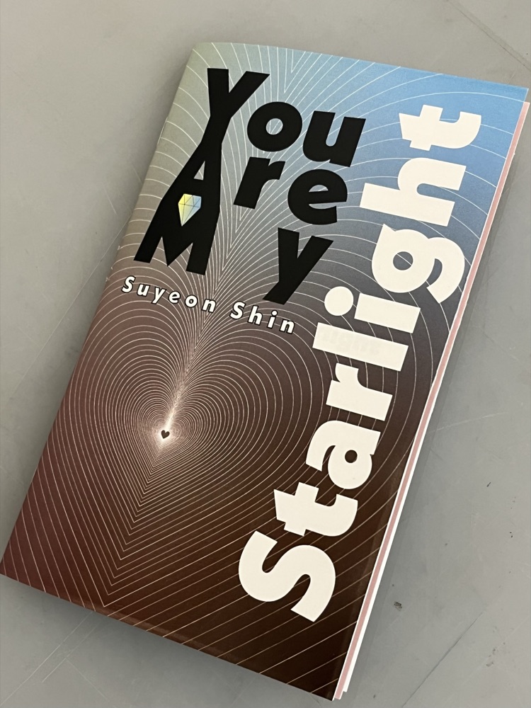
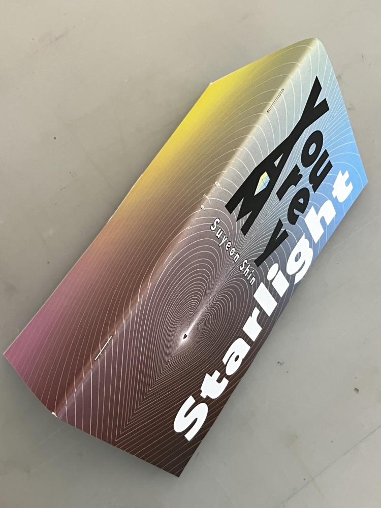
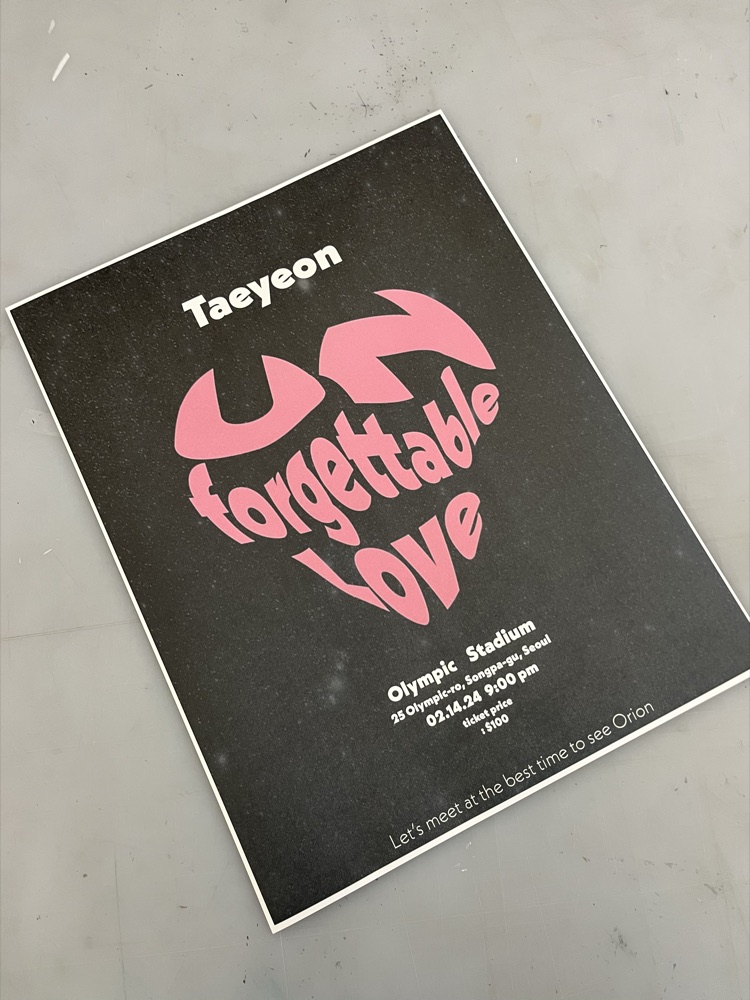
Explored how a single typeface could express different emotions and visual rhythms by creating 40 album cover designs for “Starlight” by Taeyeon using only Neue Kabel.
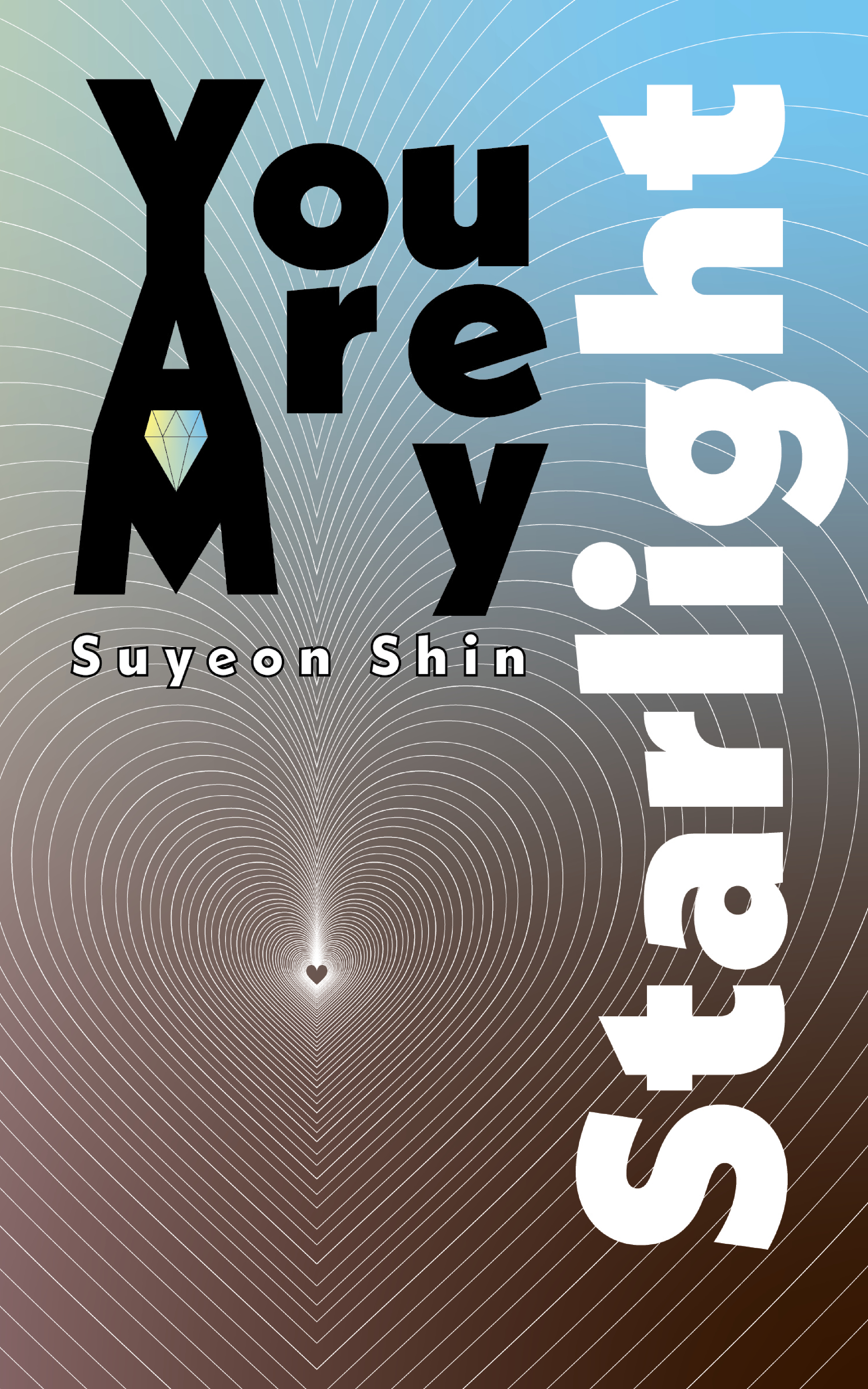
Developed 20 of the explorations into a physical songbook, using typography, color, composition, and page-to-page relationships to translate the song’s romantic atmosphere into a visual experience.
Extended the same visual language into a concert poster, exploring how typography could communicate the mood of the song across different formats.
I created 40 album cover designs for “Starlight” by Taeyeon using a single typeface, Neue Kabel. I chose Neue Kabel for its sleek, modern appearance and curved forms, which I felt could capture the song’s emotional and romantic atmosphere.
Working within the constraint of one typeface pushed me to explore how much expression could come from scale, spacing, color, repetition, and composition rather than changing the typeface itself.
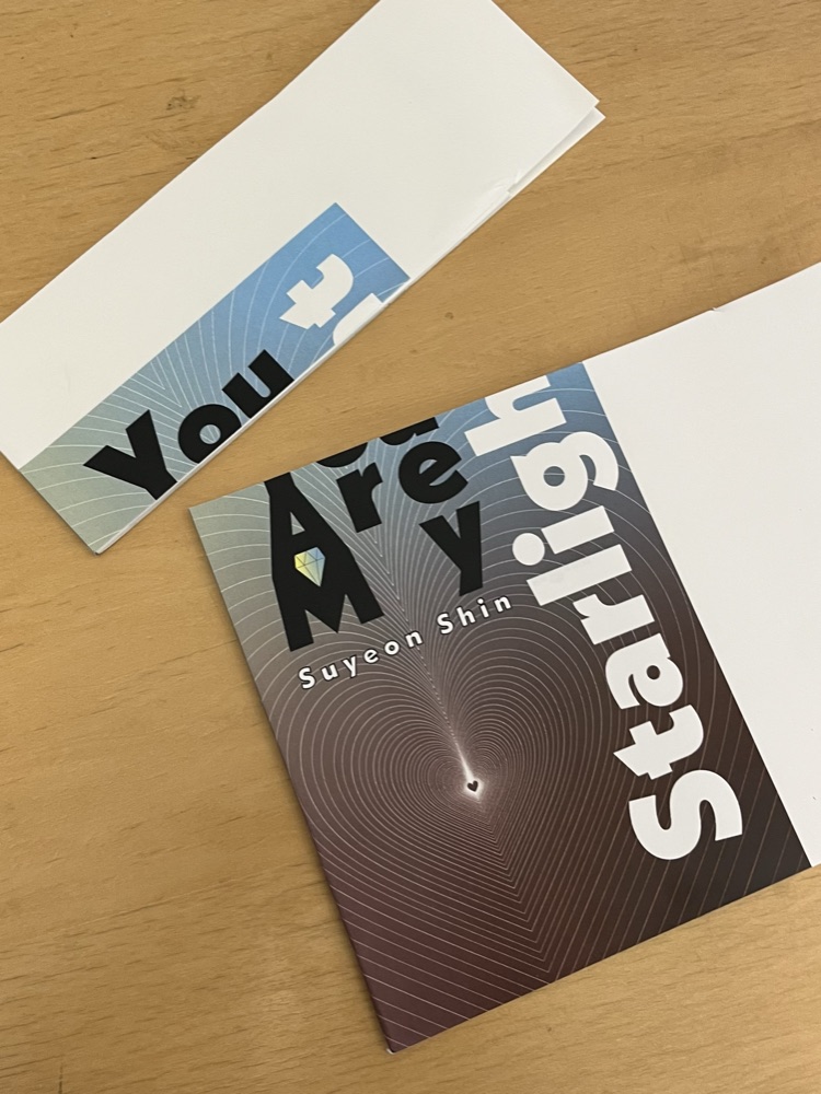
I selected 20 of the designs and brought them together into a physical songbook. Instead of treating them as separate covers, I considered how each design would relate to the next, creating rhythm and continuity as readers moved through the book.
Designing Across the Spread
As I designed the book, I became interested in the relationship between the left and right pages. Some compositions were designed to continue across the spread, allowing shapes, letterforms, and visual rhythms to connect from one page to the next.
This made the physical structure of the book part of the design itself. I chose perfect binding to support a comfortable reading experience and preserve as much visual continuity as possible across the connected spreads.
Projects · Typography
An Interactive Typographic Songbook
I recreated the physical songbook as an interactive 3D experience for my portfolio, allowing viewers to flip through the designs as a book rather than viewing them as a static gallery. As you turn the pages, Tinker Bell appears to share the design thinking behind each composition, so be sure to look out for her along the way.
Won 2nd Prize at the 2nd KOVA Capstone Design Competition (2023), hosted by the Korea Venture Business Association Daegu-Gyeongbuk.
Built the project’s storyline, framing why AKGI was needed: real instruments are expensive and tied to time and place, while demand for digital instruments keeps growing.
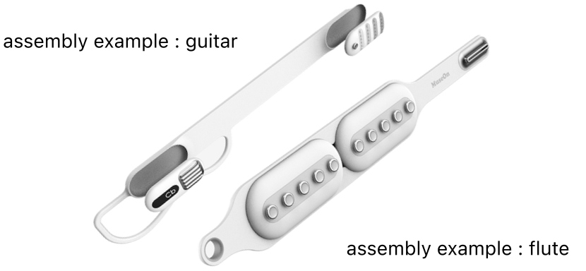
Created lo-fi designs for a modular system in which a shared control unit combines with guitar and wind-instrument modules.
Shaped a magnetic attach-and-detach interaction so modules could be swapped quickly and intuitively.
Explored instrument-specific touch through a metal-treated guitar stroke surface and wind-instrument buttons with adjustable heights.
Assembly examples · guitar and flute
Projects · AKGI
1. Why AKGI Was Needed
My role started with the question of why this product should exist. Real instruments are expensive, and they come with spatial and temporal constraints: you need room to keep them, a place where you can make sound, and time set aside to practice.
At the same time, demand for digital instruments was rising. I framed the storyline around this gap, which led us to AKGI: a digital instrument that lets people enjoy many different instruments within a single device.
2. One Device, Many Instruments
From that storyline, I worked out the lo-fi structure of the product. A shared control unit becomes a guitar or a wind instrument depending on which modules are attached to it.
Every module and device attaches and detaches with magnets, so switching between instruments feels effortless rather than like assembling hardware.
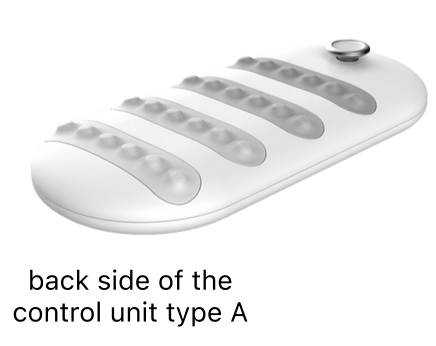
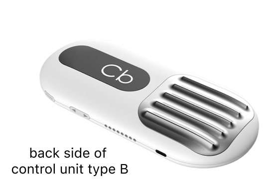
Control unit type A · backControl unit type B · back
3. Designing for Touch
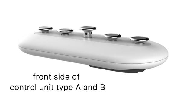
The control unit has a smooth, ergonomically protruding form so it can be used intuitively without instructions.
For the guitar, the stroke surface is finished with a metal treatment to give strumming a more tactile feel.
To recreate the feel of real wind instruments, the buttons on the wind-instrument module are shaped like trumpet and flute keys, and their height can be adjusted to match different fingering techniques.
Control unit types A and B · front
7
05
Guestbook
On desktop, the secret pen works like a flashlight!
peel a star · stick it anywhere · leave a note in secret inkgathering stars...
peel one off & stick it anywhere!
let's write the next chapter together
This book started at a vibe coding meetup in SF. At first, nothing was turning out the way I imagined, and I almost gave up on it, thinking maybe the idea wasn’t that special after all.But Jiwon saw something in it and encouraged me to demo it that night. After the demo, Jiwon and others said such kind things about the idea that I started to think maybe it was worth pursuing.Later, as I kept developing it, I started doubting it again. Then Minsun and Jongha saw what I was making and told me how much they loved the idea. Their excitement gave me the push I needed to take it further, all the way to this book.I don’t think this book would be here without you. Thank you so much ♡